Reconsider structure and layout
Dear AO Surgery Reference Team,
First of all I am very aware of all the effort you put into the new surgery reference and I think lots of thinks wer improved. I was a big fan of the "old" version and was recommending it to all of my students and my colleagues.
Unfortunately the "new" version I can not recommend to any student because it lacks the clear structure of the "old" version and to my mind the layout is not very thought through.
First of all the approaches are hard to find and appear on totally different parts within in the modules and the single modules are built with inconsistent and sometimes confusing structure.
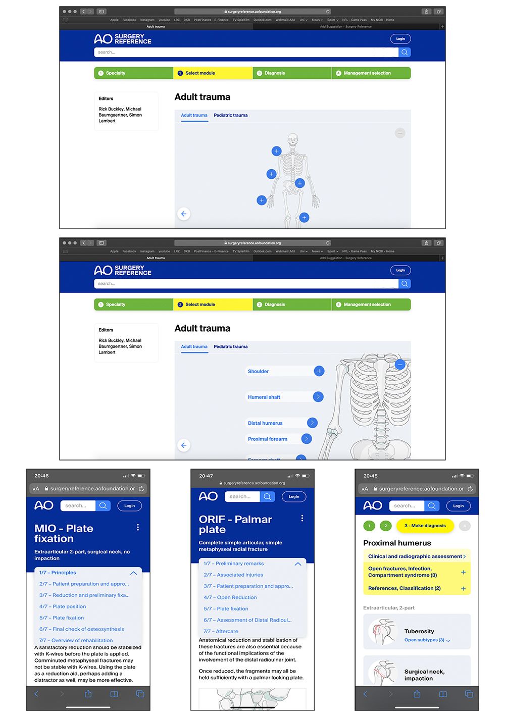
Second the layout does not allow a clear overview on the possible options. On a standard 13" Macbook or an iPhone you can not see all options without scrolling because the top panel (blue AO banner etc) is to big and the images are scaled to big etc. (see examples on the attached image). I think both can be changes quite easily.
Comments: 13
Oldest
•
Newest
•
Most likes
•
Fewest likes
-
20 Feb, '20
Manager AO SR AdminDear Felix, I am sorry to see that you no longer can recommend the AOSR to your residents. With a massive change like this, there will of course be room for improvement. Your experience of the structure being inconsistent proves that. Over the next months, we will release improvements to the UI as friction points are identified. For approaches and header, please upvote/see comments (tips) in the previous posts.
-
24 Feb, '20
Manager AO SR System"the older version is much better" (suggested by Nick Chen on 2020-02-21), including upvotes (1) and comments (0), was merged into this suggestion.
-
02 Mar, '20
Manager AO SR Admin MergedDear Issam, thank you very much for your feedback. The skeleton navigation was a tricky part to work on ... the old skeleton had too small fields and we did not have room to expand into subjects like periprosthetic fractures, reconstruction, and veterinary; on mobile devices. Thus, although we would not go back, we will work to improve what we have now. When we do that, your comment will be taken in to consideration. Best regards, Lars
-
07 Apr, '20
Jeasson Javier Pérez RiosEsta herramienta ha sido fundamental para muchos residentes y ortopedistas en las escuelas de formación en México, aunque reconozco el gran esfuerzo que ha realizado AO Fundation por esta nueva versión, la práctica muestra la realidad y esa es que la versión previa es mucho mas fácil, intuitiva, rica en herramientas como los esquemas, videos y opciones de tratamiento. Ojalá haya próximamente una nueva reconfiguración y se lance nuevamente una versión en app. Muchas gracias por su atención.
-
30 Apr, '20
Manager AO SR System"Bad version" (suggested by Shadi on 2020-04-29), including upvotes (1) and comments (0), was merged into this suggestion.
-
17 May, '20
B.A. van Dijkman MergedPlease, Make AO surgery reference easy to find and to acces.
Since the change to this new AO site, it is horrible to acces en not possible. The new site a this point is absolute no improvement en disencourage members to go to the site at all. -
08 Jul, '20
Manager AO SR System"Make AO surgery reference easy to find and to acces" (suggested by B.A. van Dijkman on 2020-05-17), including upvotes (1) and comments (0), was merged into this suggestion.
-
01 Aug, '20
CARLOS JULIO ESCOBARI am agreed with the previous comments. I find the old version much better, easier. I was so acustumed to used it, that i coud rappidly to find all i neded.
This new version is hard and troblesome to manage with. I miss the old version -
08 Oct, '20
Manager AO SR System"Very Cumbersome and irritating after update" (suggested by Mohan Rao on 2020-09-12), including upvotes (1) and comments (0), was merged into this suggestion.
-
09 Oct, '20
Manager AO SR Admin MergedDescription: The new update has made the app very cumbersome and uncomfortable to use The older versions whr very user friendly and it was a app dedicated for Orthopedic Trauma and CMF and Veterinary included in it. Why does an Orthopedic surgeon need to see CMF and Vet Options. The UI and navigation of the app is pathetic and it seems as its being made by some over excited developer without taking the views of people who have used the app since 8 yrs. Also the app crashes frequently if u choose
-
09 Oct, '20
Manager AO SR AdminDear Mohan, thank you for your feedback. I am sorry to hear that you are struggeling with our new user interface. We plan a first round of improvements early next year. (Some info: The UI was developed over 3 rounds of user testing, including both experienced and unexperienced AOSR users, using a new batch of testers in each round. Vet surgeons (30%) are interested in trauma content.) Regarding crashes, thank you so much for pointing this out. We will look into this. Kind regards, Lars
-
14 Aug, '23
Elena Spadini System"The old presentation with the skeletal was more easy to use..." (suggested by Issam on 2020-02-29), including upvotes (19) and comments (1), was merged into this suggestion.